


With no existing visuals to build on, I created a dynamic identity from scratch. The hand-drawn logotype adds a personal, tactile feel—expressive, angled, and bold. The visual direction aimed to reflect a subjective, energizing experience. A vibrant palette, halftone textures, and flowing shapes captured movement, while gradients and illustrations evoked curiosity and a sense of discovery. Everything points back to one core idea: flow.


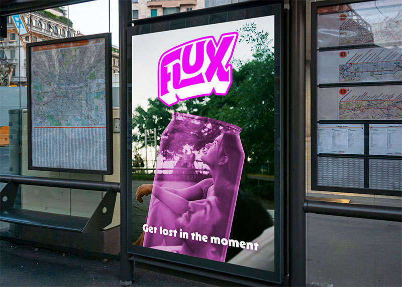
Packaging design uses large bubble forms and angled typography to express action and energy. Contrasting colors help each flavor feel distinct, yet still part of the same family. Ads play with the same bold, custom typography and vibrant palette, paired with dynamic copy and flowing backgrounds. Instead of relying on photography, abstract textures and playful layouts bring the brand to life—joyful, fresh, and full of momentum.


While working as an in-house designer, I had the opportunity to refresh Knowledgehook's brand, including the main logo, colours, typography, illustrations, and style guides.

Freelance project for a non-profit organization, designing both a book cover and interior with illustrations for two books by the same author. The designs have hand-lettered titles, illustrated covers, and illustrations throughout that utilize AR technology.

Jay's Cafe is a personal design project for a cozy cafe. Exchanging small tables for comfy booths and couches, Jay's Cafe provides a friendly atmosphere to spend the day in. The logo and designs reflect the warm and inviting tone for this fictional cafe.

