


From the beginning, the brand voice was built around one question: what if security didn’t suck the joy out of the internet? The copy takes a playful, irreverent tone making fun of digital scammers, sketchy trackers, and the outdated brands still using scare tactics. The language, visuals, and overall tone were all designed to connect with a younger, internet-savvy audience that just wants to live their life online without worrying about every click. They want something that feels fun, safe, and refreshingly honest.

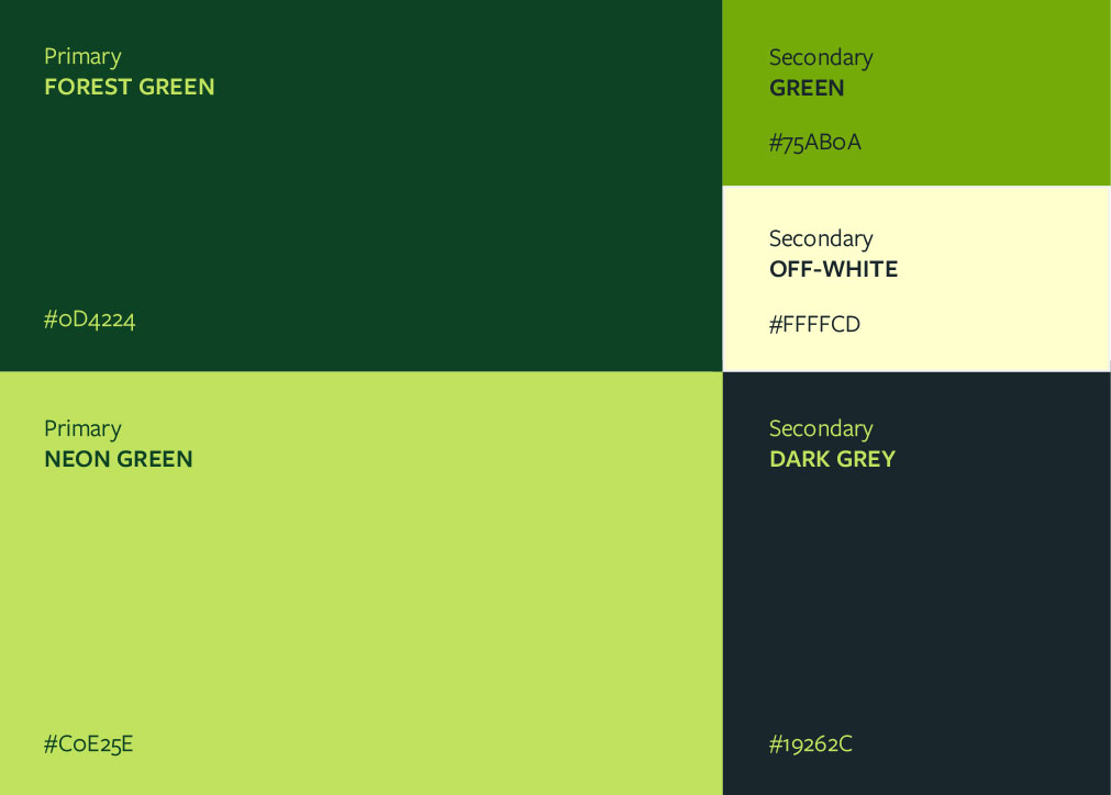
The final brand identity is bold, expressive, and impossible to ignore. I created a visual identiry, plus a full website design and real-world applications. The colour palette pairs a deep forest green with an electric neon green for a look that feels both secure and alive. The typography is extra bold and high-impact, giving the copy room to speak loud and clear. One standout detail is a funny, googly-eyed padlock character that adds a wink of humour while reinforcing the core idea: you’re protected, and you don’t need to panic. The result is a visual world that feels electric, exciting, and genuinely fun! Security, with a sense of humour.


While working as an in-house designer, I had the opportunity to refresh Knowledgehook's brand, including the main logo, colours, typography, illustrations, and style guides.

Freelance project for a non-profit organization, designing both a book cover and interior with illustrations for two books by the same author. The designs have hand-lettered titles, illustrated covers, and illustrations throughout that utilize AR technology.

Jay's Cafe is a personal design project for a cozy cafe. Exchanging small tables for comfy booths and couches, Jay's Cafe provides a friendly atmosphere to spend the day in. The logo and designs reflect the warm and inviting tone for this fictional cafe.

